Kernel provides a set of analysis tools to give you a quick glance at your datasets to verify that tasks were presented correctly, and otherwise aid in your research. These tools are accessed in the Pipelines tab for each dataset. For instructions on downloading an analysis file, see Downloading datasets.
Kernel Analysis Tools
Analysis: Task
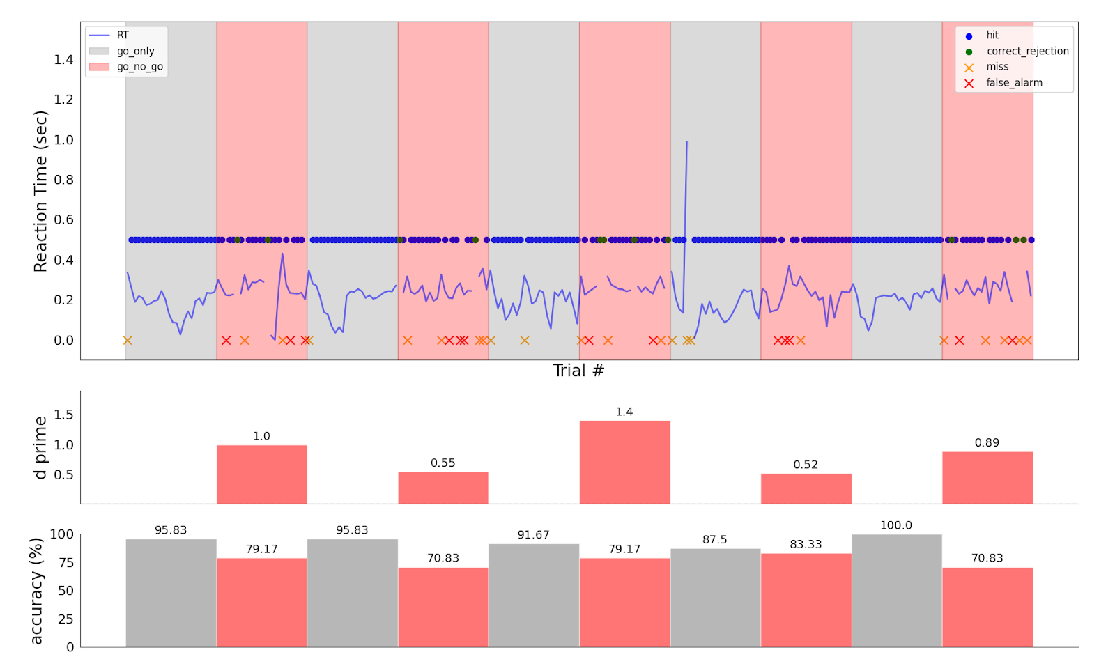
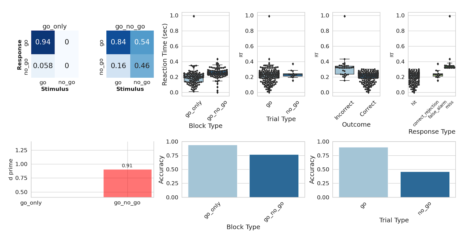
These figures are an example output from a behavioral analysis run on Go/No-Go data. You can expect to see summary metrics of the task-specific behavioral data, including reaction time, accuracy, and response classification; and also distribution of the timing of different events in the task, to check that the task was presented correctly.
NIRS: General Linear Model
The General Linear Model (GLM) is a statistical technique used to analyze hemodynamic signals, originally developed for functional Magnetic Resonance Imaging (fMRI) and subsequently adopted by the functional Near-Infrared Spectroscopy (fNIRS) community. Kernel applies preprocessing to the data before GLM statistical analysis, identical to the preprocessing in the SNIRF: Hb Moments pipeline.
Design Matrix
The design matrix for the GLM, shown in the Analysis report, typically includes:
- Regressors for Main Conditions: These are experiment-specific and represent the main conditions in the experiment.
- Trend-Capturing Regressors: A set of discrete cosine transform basis functions used to capture trends in the data.
- Constant Term: A baseline constant term.
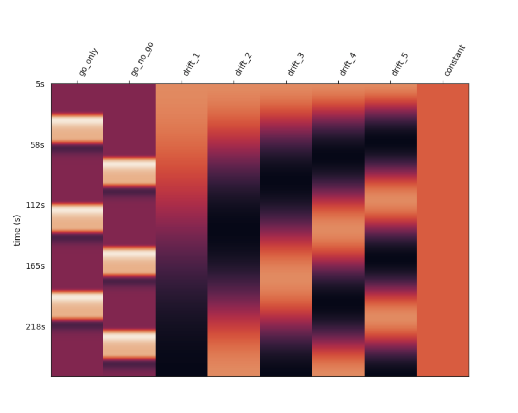 Example Design Matrix
Interpretation
This plot is necessary to interpret the following statistical results — it indicates how the data was modeled and how conditions were defined for statistical inference.
Contrasts
Contrasts (typically T-contrasts) are formed between regressors of interest. An interactive topoplot is created to visualize the effect sizes, p-values, and T-statistics for each channel.
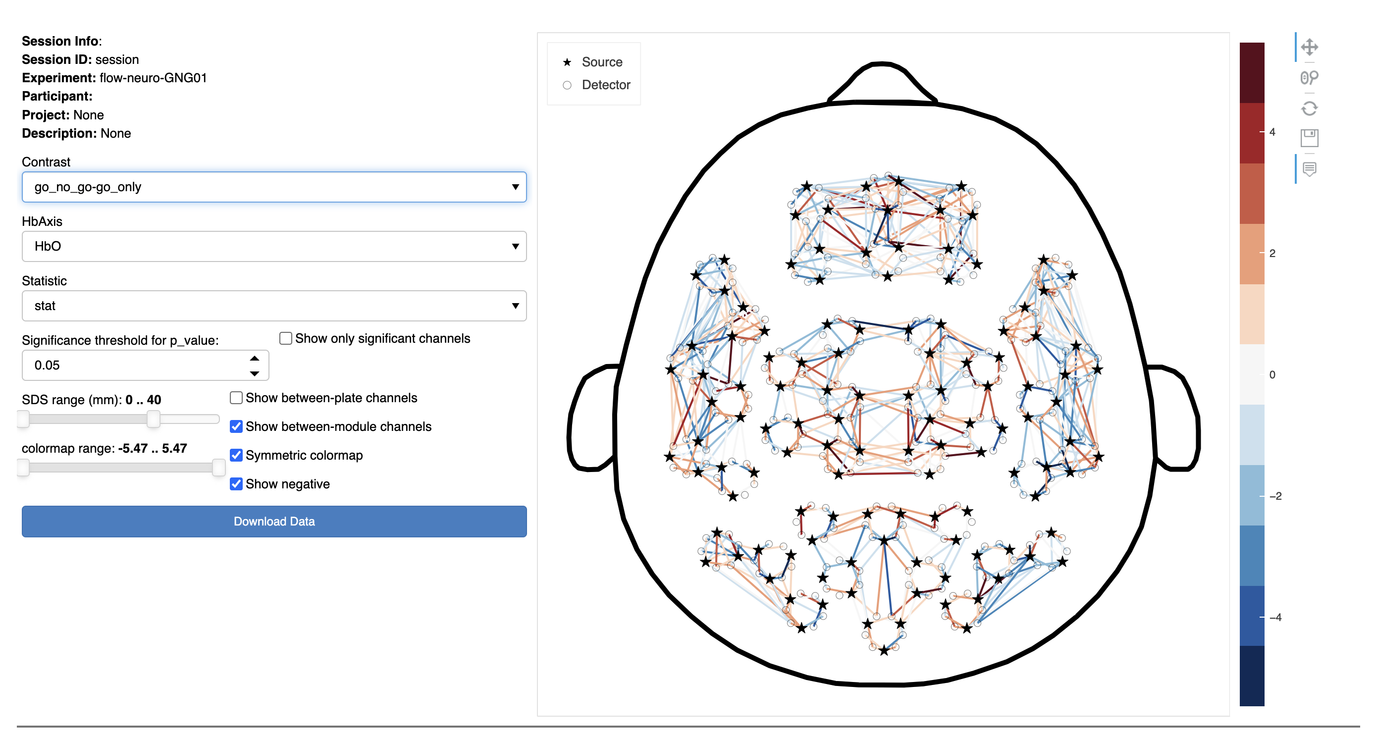
In this interactive figure, the statistical results of the GLM analysis are shown using a top view of the head and a schematic channel layout.
The plot on the right represents source-detector (SD) pairs as colored lines between the corresponding source (stars) and detector (circles). The shading of these lines are defined according to the colormap range. Hover over a line to show the channel name and associated value.
On the left side of the figure, there are controls to dynamically customize the data visualized:
- Contrast: Select the experimental contrast of interest (i.e., statistical comparison between conditions). For a given experiment, several contrasts may be available.
- Hb Axis: Choose a chromophore (HbO or HbR)
- Statistic: Chose from:
- Theta weight (effect size)
- Stat (this may be a F-statistic or a t-statistic for the GLM contrasts)
- p-value
- Significance threshold for p_value: Select a p-value value level above which channels will be ignored.
NOTE: this setting is ignored unless the Show only significant channels checkbox is selected. - Show only significant channels: Select this checkbox to limit the display to only statistically significant channels based on the threshold specified.
- SDS Range: Only show channels above (the left control) and below (the right control) the number selected.
- Colormap Range: Set the lower and upper limits of the color map (to optimize the display).
- Show between-plate channels: Select to include channels where the source and detector are on different headset plates.
- Show between-module channels: Select to include channels where the source and detector are on different modules.
- Symmetric colormap: Makes the color representation symmetrical. It is usually desirable for the maximum negative and positive values of the scale to match. Uncheck this option to remove that constraint.
NOTE: Selecting this affects the Colormap Range slider (the maximum bound of the color map is mirrored). - Show negative: Select to include negative values based on the option selected in the Statistic pop-up menu above.
To download the results from the analysis in a .csv format:
- Click the Download Data button at the bottom left of the figure.
NIRS: Epoched
Epoched analysis offers a straightforward method for examining results by segmenting the data around events of interest and analyzing the average signal by condition. This approach is suitable for experimental designs featuring long rest periods between blocks or trials, allowing the hemodynamic response to return to baseline before the next condition. For fast event-related designs, the GLM is required.
Before epoching the data, additional preprocessing steps are performed. The steps below follow the processing steps in the SNIRF: Hb Moments pipeline.
9. High Pass Filtering
This step involves moving average detrending with a sliding window of 100 seconds.
10. Low Pass Filtering
A Finite Impulse Response (FIR) filter is used, with a cutoff frequency of 0.2 Hz, a width of 0.1 Hz, and a ripple of 40 (not too steep to avoid ringing artifacts and phase distortion). This filters out heart rate related fluctuations and high-frequency noise to improves statistical outcome.
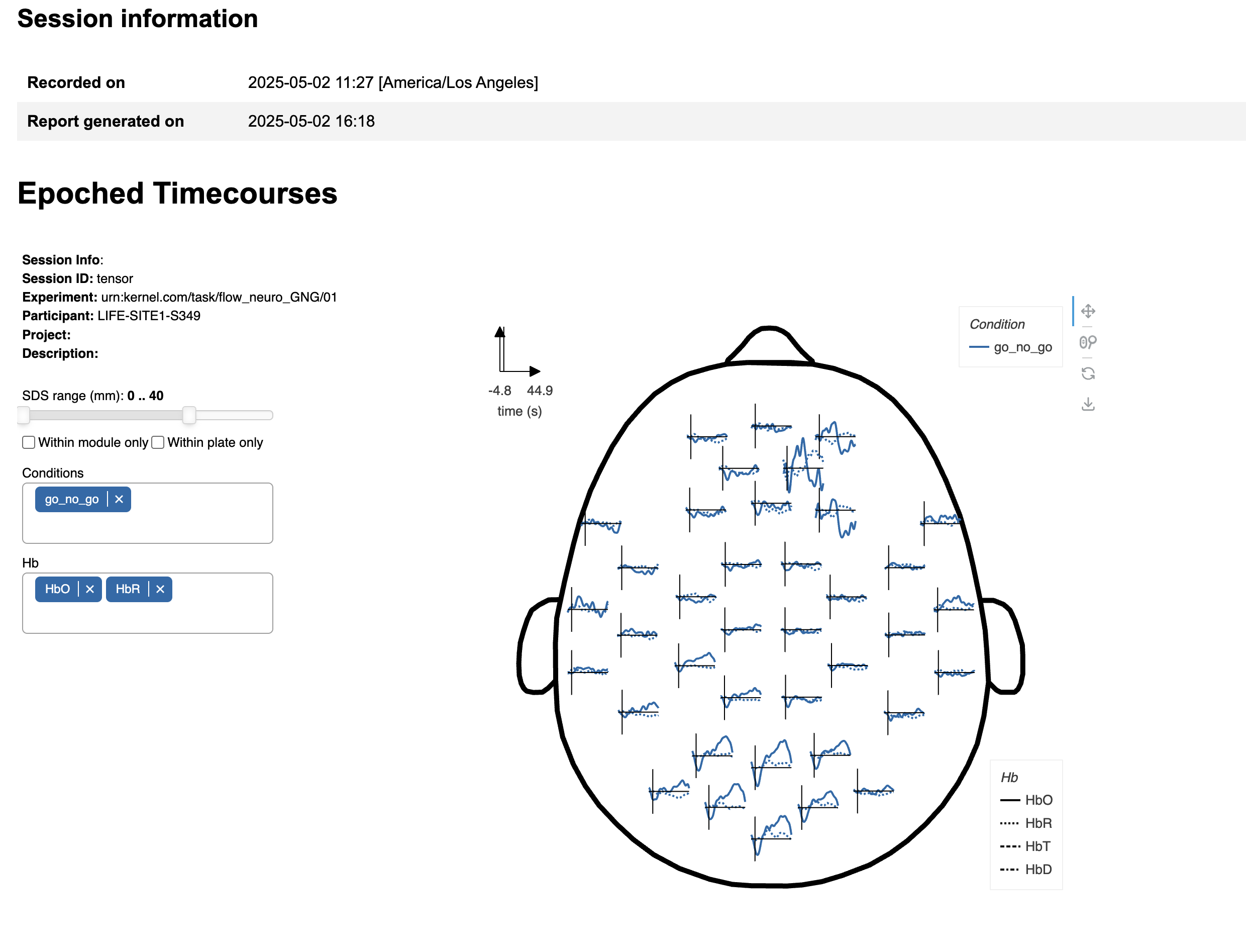
This interactive figure displays the results of the epoched analysis from a top view of the head, using a schematic layout of the modules. Each line graph represents the average timecourse of the selected hemoglobin signal (e.g., HbO, HbR) across all channels terminating on the module corresponding to the plot's location.
On the left side of the figure, there are controls to dynamically customize the data visualized:
- SDS Range: This slider filters channels by source-detector separation (SDS). By default, all channels with SDS ≤ 40 mm are included, spanning within-module, inter-module, and cross-plate connections.
- Within module only: Restricts analysis to channels where both the source and detector are located on the same module ( SDS ≤ 26 mm).
- Within plate only: Restricts channels to those within and between modules only on the same physical plate. Inter-plate channels typically have longer SDS. See a map of the plates here.
Conditions: Select one or more experimental conditions to visualize. Available conditions depend on the specific experiment run.
Hb Axis: Choose which hemoglobin signal(s) to display:
- HbO: Oxygenated hemoglobin
- HbR: Deoxygenated hemoglobin
- HbT: Total hemoglobin (HbO + HbR)
- HbD: Hemodynamic difference (HbO - HbR)
To download the results from the analysis in a .png format:
- Click the Download Data button in the icon menu at the top right of the figure.
Analysis: EEG
The EEG analysis produces a single interactive montage: every electrode is drawn at its position on a top view of the head, and clicking an electrode (or picking it from the control on the left) inspects it in a detail panel. What the montage and detail panel show adapts to the Task — an evoked-response view for event-related Tasks, and a spectral view for sustained/resting Tasks such as eyes-open/eyes-closed. In both, the Condition / contrast control selects an individual condition or a pairwise contrast (B − A), and the Electrode control jumps to any electrode.
The analysis runs on conditioned EEG: bad electrodes are detected using the same criteria as the EEG QC report, and the signal is band-pass filtered (0.1–40 Hz). Electrodes flagged as bad are marked on the montage so you can weigh their traces accordingly — an orange dot means the electrode was repaired by interpolation from its neighbors, and a red dot means it was flagged bad but had too few nearby good electrodes to interpolate, so its original data was left in place. Hovering an electrode shows its status and the reasons it was flagged, and the session-info box lists the bad electrodes.
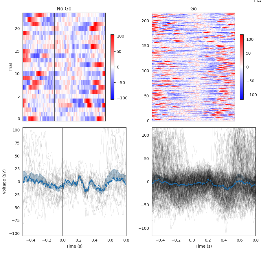
Event-related Tasks (evoked response)
For Tasks with discrete events, each electrode shows its condition-averaged event-related potential (ERP) as a small timecourse, and the Analysis control chooses what the montage and detail panel show:
- Evoked potential: Every trial as an image (trial number on the y-axis, voltage as the heatmap), plus the mean ERP with a standard-error band.
- Evoked power: Trial-averaged, baseline-corrected time-frequency power (time by frequency).
- Inter-trial coherence: Consistency of the signal's phase across trials, over time and frequency.
For a contrast, the montage and detail panel show the difference (the ERP difference wave, the power difference, or the ITC difference). The available conditions and contrasts depend on the specific Task — for example, in the Go/No-Go Task you can compare go vs. no-go trials for both the stimulus- and response-locked events.
Resting / sustained Tasks (spectral)
For Tasks whose response is a sustained change in ongoing oscillatory power rather than a transient event — most notably eyes-open/eyes-closed, where occipital alpha increases with the eyes closed — the montage is spectral. Clicking an electrode shows its full power spectrum in the detail panel (the median across blocks with an inter-quartile-range band). The Montage view control chooses what each electrode shows on the head:
- Spectra: Each electrode's power spectrum (log power vs. frequency) as a small curve at its scalp position.
- Band power: Each electrode as a filled disk colored by its power in the selected frequency band (the Band control: delta, theta, alpha, beta, or gamma), i.e. a scalp topomap — for example, alpha power localizing to occipital electrodes with the eyes closed.
For a contrast (for example, eyes closed − eyes open), the montage and detail panel show the log-power ratio on a diverging scale centered at zero (warmer where power increased with the eyes closed). The Topomap color range control manually adjusts the band-power topomap's color limits (which otherwise default to a robust range per band).