Kernel Flow provides four quality control (QC) reports to help you evaluate the results of your Flow data:
To view or download QC files:
- In the Portal, navigate to the dataset you want to analyze:
- Click Pipelines to open the Pipelines tab.
- Click the QC header to expand that section.
- Click one of the buttons to download the QC file(s).
Descriptions of the QC reports are listed below.
NIRS Basic quality control report
This report contains a Session Summary and several sections, each of which assigns a status to a certain aspect of data quality. The statuses are determined by color and are listed below.
- Red: indicates an issue
- Orange: indicates a warning or potential issues
- Green: indicates no issues
Sections that are assigned orange or red statuses should serve as flags to improve data recording conditions or to retake the dataset.
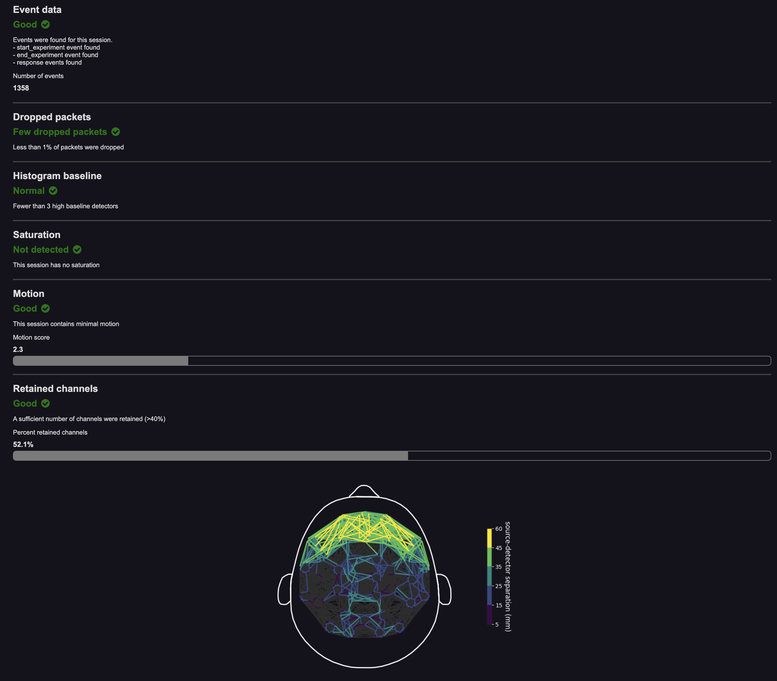
- Event data: This section provides an overview of Task events received for this dataset. It checks for the number of
start_experimentevents,end_experimentevents, and response events (key presses made by the participant). It also lists the number of total events in the session. An orange or red status indicates that a certain type of events was not received. You may ignore this warning if the dataset was not supposed to have Task events or you did not expect certain events, like user responses. - Laser Intensity: This section checks whether the target number of photon counts was achieved on channels with a long source-detector separation (SDS). An orange or red status might indicate hardware issues or failure to tune lasers, which can result in detector saturation.
- This section will only show up in the Basic QC if it is marked with a red or orange status.
- Dropped packets: This section checks for dropped data due to USB transfer or other issues. An orange or red status might indicate software issues.
- This section will only show up in the Basic QC if it is marked with a red or orange status.
- Histogram baseline: This section checks for the presence of bad detectors, which usually have high baseline in their histograms. An orange or red status might indicate hardware issues.
- This section will only show up in the Basic QC if it is marked with a red or orange status.
- Saturation: This section checks for saturation of data in channels with short SDS. Saturation may mean that lasers were not properly tuned prior to recording. An orange or red status might indicate hardware issues or failure to tune lasers.
- This section will only show up in the Basic QC if it is marked with a red or orange status.
- Motion: This section checks for the presence of motion in the data. An orange or red status indicates that a participant moved too much, which introduced artifact into the data. Attempt to reduce participant motion.
- Signal: This section gives a signal strength "score," based on the percent of channels that are analyzable. An orange or red status indicates signal percentage below 50%. Attempt to obtain better signal next time.
NIRS Expert quality control report
This report contains seven sections. Click the name in the header of the report to jump directly to that section.
- Grayplot
- Motion
- Stacked Plot
- Total counts Time Series
- Total counts Topoplot
- Physiology (Physio)
- Retained Channels Topoplot
Grayplot
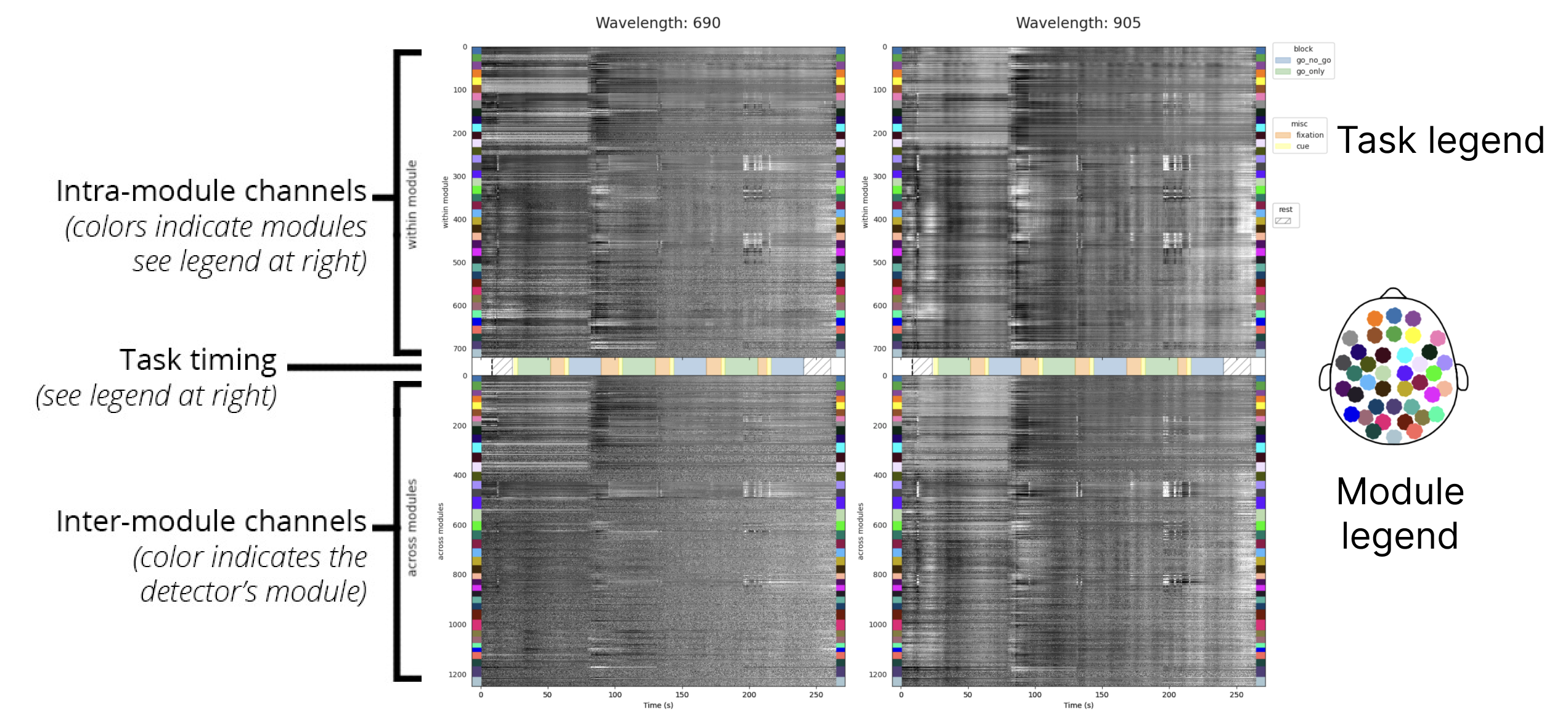
The grayplot (or carpet plot) visualizes global variations in signal intensity in the raw data. To obtain these visualizations, signal fluctuations are normalized (using robust scaling) and depicted with a grayscale color map:
- Signal above the median manifests as lighter regions on the plot.
- Signal below the median corresponds to darker regions.
The top section displays total photon counts recorded from intra-module channels (source and detector in the same module). Data are ordered by module, and color-coded according to the layout overview on the right.
The bottom section displays total photon counts from cross-module channels (source and detector from different modules). This section is color coded based on the module to which the detector belongs.
Interpretation
This visualization highlights global artifacts. Vertical bands or artifacts that span all subplots are indicative of global signal variations, which may correspond to physiological noise, motion, or other non-neural sources (brain activations tend to be somewhat more localized). Artifacts that align with large signal fluctuations in the gyroscopes are likely to be motion-related. Global oscillations that align with the task structure may reflect systemic physiology.
Motion
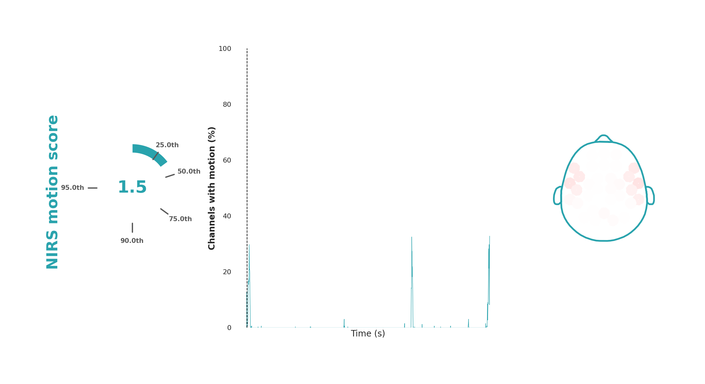
The motion plot visualizes participant head motion during a recording, which introduces noticeable spikes that affect multiple channels simultaneously. For each time point, the number of channels with motion artifacts (spikes) is counted. The middle plot shows the time course of these artifacts, with time on the x-axis and the percentage of affected channels on the y-axis. This plot is overlaid on colored blocks indicating the task structure, if applicable.
To quantify the motion into a score, we average the squared fraction of channels affected by motion during the task blocks, therefore weighting the motion artifacts that affect many channels more heavily. The result is compared to a range observed across 5200 recordings from various studies (Dubois et al., 2024). The percentile in which the current dataset falls is converted to a score from 1 to 10, with 10 indicating the most motion. This score and its percentile are displayed to the left of the time series plot. On the right side, a spatial map shows the percentage of the recording affected by motion per each specific module. For instance, uniform global coloration indicates global head movements, whereas isolated movement in specific regions (e.g., raising eyebrows) would show as localized dark pink or red color.
Interpretation
The motion plot is useful for identifying and assessing the severity of global or region-specific movement artifacts. Kernel's processing pipelines include motion correction, often allowing for the analysis of data with motion spikes. Still, the motion plot provides valuable insights, indicating whether participants need reminders to remain still or if the setup is causing participant discomfort.
Stacked plot

The stacked plot is very similar to the grayplot with an identical layout. The main difference is that the data fluctuations are shown as lines rather than as a heatmap. Also, the data is averaged for all detectors within a module to make the visualization less crowded. For within module channels, signals from the six detectors are averaged together; for across module channels, signals from the six detectors and all incoming sources are averaged together.
Interpretation
Like the grayplot, the stacked plot is useful in identifying global physiological artifacts, movement artifacts, and other non-neural sources. Spike-like events are somewhat easier to identify in this visualization than in the grayplot, making it a good complement.
Total counts time series
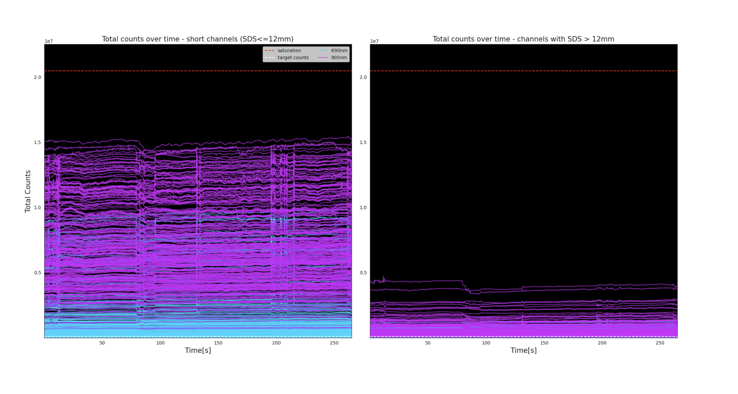
In these plots, total counts for each channel are displayed over the course of the recording. The plot on the left contains within-module channels. The plot on the right contains only across-module channels.
The wavelengths are represented by color: 690nm in cyan and 905nm in magenta. The dashed red horizontal line represents the point of saturation. Saturation may occur if laser power has not been properly adjusted prior to recording (see Tuning the lasers).
Interpretation
This plot provides another method to detect the presence of global artifacts in the data, e.g. large spikes or baseline shifts affecting several channels. This plot is also useful in detecting dead channels or those with poor signal strength, which will show up as lines with consistent low amplitude.
Total Counts topoplot
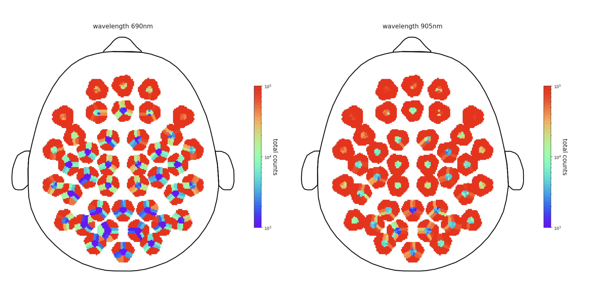
In this figure, mean total counts for all within-module channels are represented spatially as a topoplot. The 690nm wavelength is on the left, and 905nm is on the right. The color map is on a log scale to visualize the range of total counts which may span several orders of magnitude.
Total counts topoplot Interpretation
Total counts are a simple proxy for signal strength. This is similar to the live display in the Kernel Flow Desktop Application, however in this static image the data are averaged across the entire recording.
Physiology (Physio)
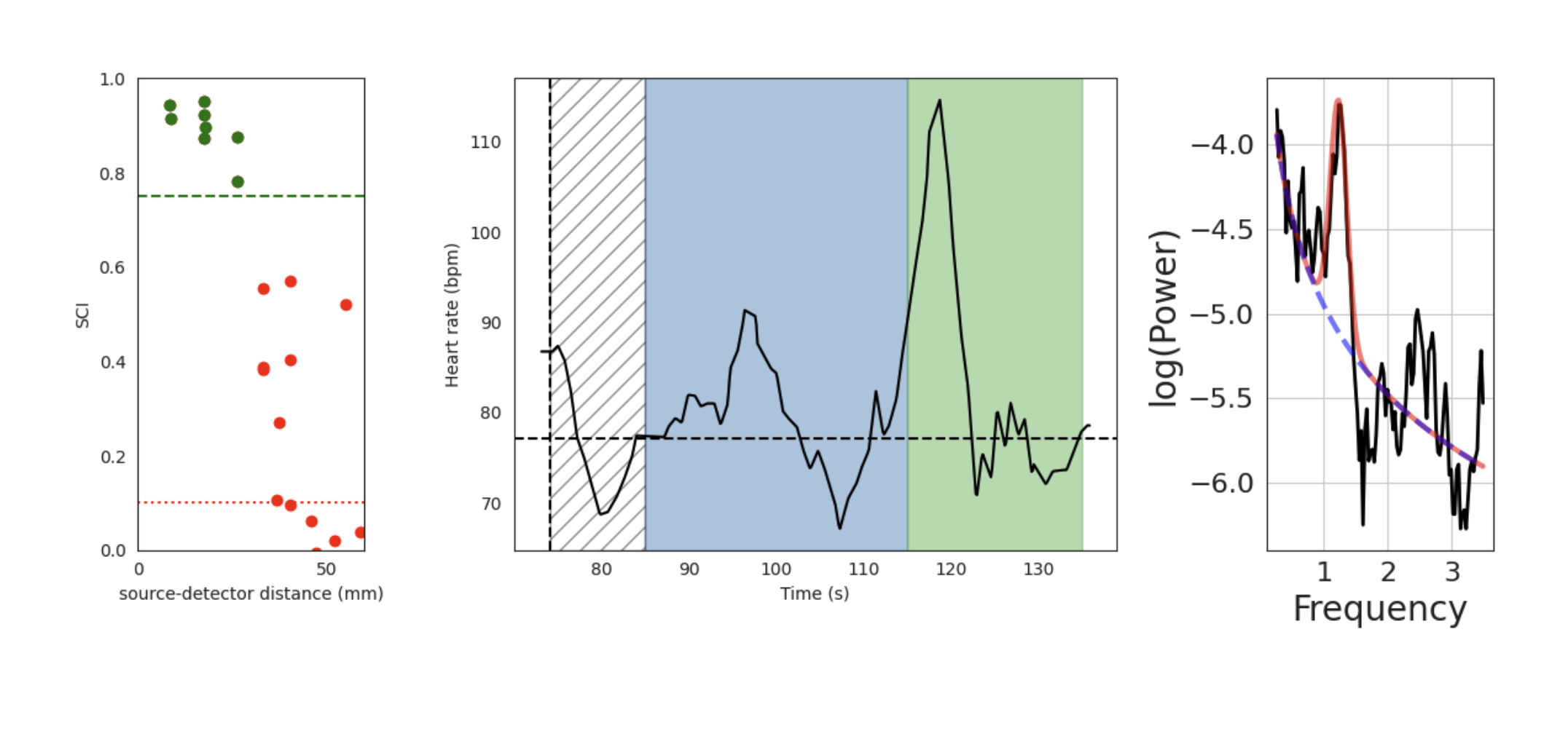
These figures display the physiology metrics pulled from NIRS data. The Flow device typically has several sources which fire at double the rate of all others, which allows us to sample fast enough to capture even the fastest heart rate. On the leftmost graph, each dot represents a channel formed with one of these sources. The x-axis shows the source-detector distance for each channel. The y-axis shows the Scalp Coupling Index (SCI), which measures the correlation between the intensities recorded for the two wavelengths used in our system, after filtering in the heart rate band (0.5 - 2.5 Hz). If it is high—above the green dashed line at 0.75—it is likely that there is a strong heart rate signal. On the middle graph, data from all green channels (the ones with the highest SCI, at least 5) are averaged to create a time by heart rate (in beats per minute) line chart, overlaid on the color-blocked task event sequence (if applicable). On the rightmost graph, the same data is converted to the frequency domain to create a power spectrum. The overlaid red line is fit to the peak of the heart rate based on the black line. The dashed blue line represents the fit to the "aperiodic" component of the power spectrum.
Interpretation
The physiology plots are useful for analyzing data on heart rate during a data recording. If the SCI of the selected channels is low, or the time course of the heart rate is very noisy (large jumps), it may indicate that there was poor contact between the fast firing source and the forehead. Physiological metrics derived from this data may be of poor quality.
Retained Channels topoplot
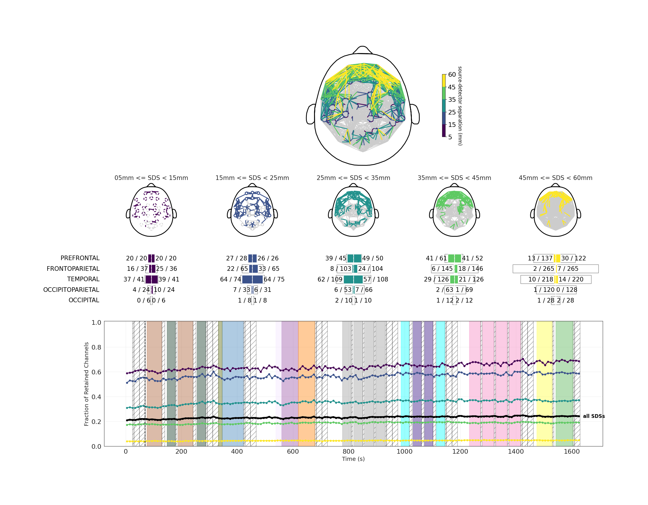
This visualization shows the channels that will be retained for analysis purposes in five different ranges of source-detector separations (SDS). SDS refers to the distance between the light source and the detector for a given channel. The decision for whether a channel is retained takes into account total counts and peak counts, as well as the shape and height of the histograms at the detector.
In the figures, the presence of a color other than gray indicates a channel whose data will be retained for analysis. Lines are drawn between each channel's source and detector. In the top figure, all SDS ranges are overlapped on a topoplot. In the five topoplots just under that, the SDS ranges have been separated by range and color.
In the third row of the visualization, the figures are further quantified by expressing the exact number of channels retained for analysis in each SDS, separated by headset plate. DevKit QC reports will not include this quantification, as the DevKit's module locations are flexible and not divided into plates.
The bottom plot shows how retained channels within each SDS change over time. Each point on the line represents the average percentage of channels retained across the next 10 seconds, with samples containing motion artifacts excluded. Line colors correspond to the same SDS colors used in the topoplots above. In most cases, the number of retained channels increases gradually over time as the device warms up and additional channels cross the inclusion threshold.
Interpretation
Retained channels are a proxy for how much analyzable data was obtained from this participant in this dataset, based on the strength of the signal and the presence of artifacts. You should expect to see higher numbers (and more filled-in topoplots) for the lower ranges of SDS since there is less distance for the light to travel and therefore less risk of the light being blocked in its path. The most important SDS for analysis of NIRS data are 15-25 mm and 25-35 mm. Higher SDS may not have many retained channels, especially in people with thick and/or dark hair.
The bottom plot can also be used to assess the stability of the recording. It shows whether sudden movements or headset adjustments during the session altered the pattern of retained channels. Sessions with large or abrupt changes in the number of retained channels should be interpreted with caution.
EEG quality control report
The EEG QC report evaluates the quality of each EEG electrode and of the recording as a whole. Each electrode is scored on several metrics and flagged as likely-bad when a metric falls outside its acceptable range. Because the acceptable amplitude and power levels depend on the recording's overall scale and on the montage, the amplitude, high-frequency-power, and line-noise checks are relative: an electrode is flagged when it is a statistical outlier compared with the rest of the cap, rather than against a fixed value. These relative checks need enough electrodes to establish a norm. The high-frequency-power and line-noise checks work down to small montages (about 6 electrodes), because those measures pinpoint a noisy electrode sharply against otherwise-tightly-grouped channels; the broadband-amplitude comparison is less reliable with few electrodes (a clean but higher-amplitude site can look like a noisy one), so it runs only on fuller caps (20 or more electrodes). In addition to that relative comparison, both amplitude and high-frequency power carry an absolute sanity limit: an electrode whose amplitude or high-frequency power is physically impossible for EEG is flagged at any montage size. Relative comparison can't see it when an entire recording is corrupted (with every channel equally bad there is no outlier to stand out), so these absolute limits are what catch a globally-bad recording. The dead-channel, clipping, spectral-fit, 1/f, and coupling checks likewise use fixed criteria (a near-zero or normalized quantity means the same thing at any scale). On denser montages (20 or more electrodes), an additional spatial check flags any electrode whose signal is an outlier relative to its neighbors (Local Outlier Factor). The report applies the same detection criteria the analysis pipeline uses to interpolate or drop bad channels, so the report and the analyzed data agree on which electrodes are bad. The report is organized into the sections described below.
Bad channel summary
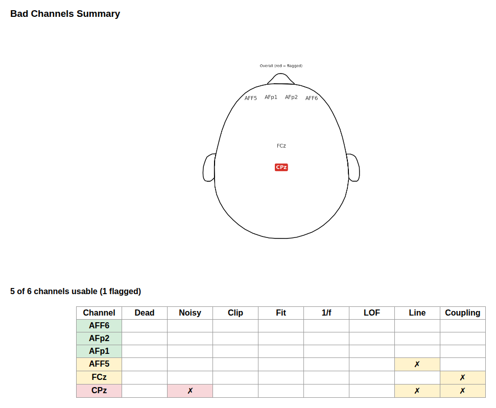
This section is the at-a-glance verdict. A line reports how many electrodes are usable (for example, "18 of 20 channels usable (2 flagged)"). A scalp map shows every electrode's name at its position, with bad electrodes highlighted in a red box and clean ones shown plainly, and a table lists every electrode against the specific reasons it was flagged:
- Dead — flat / near-dead amplitude (e.g. a hardware drop-out)
- Noisy — amplitude or high-frequency (muscle/broadband) power that is an outlier relative to the rest of the cap
- Clip — saturating / clipping signal
- Fit — poor fit to the expected spectral shape
- 1/f — flat spectrum (missing the expected 1/f structure)
- Coupling — poor electrode-to-scalp coupling
- LOF — spatial outlier: the signal stands out from its neighboring electrodes (Local Outlier Factor)
- Line — 50/60 Hz line noise that is disproportionate relative to the rest of the cap (reported, but does not by itself mark the electrode bad; mains that is uniform across the cap flags no electrode)
In both the map and the table, each electrode's name cell is colored by its overall status: red if it carries at least one reason that marks it bad, amber if its only reason is informational (line noise, which is usually global and filterable rather than a sign of a bad electrode), and green if it is clean. Line-noise-only electrodes stay in the "usable" count.
Interpretation
Use this section first. A map with no red boxes means every electrode passed the checks. Bad electrodes are candidates for exclusion or for improving electrode contact in future recordings; the reason columns indicate whether the issue is contact-related (coupling, dead), environmental (line noise), physiological or bad-electrode high-frequency noise (noisy), spatial (LOF), or hardware (clipping). In the analysis pipeline, a bad electrode with enough good neighbors is repaired by interpolation, and one without is left in place but marked; see Analysis: EEG.
Channel quality metrics
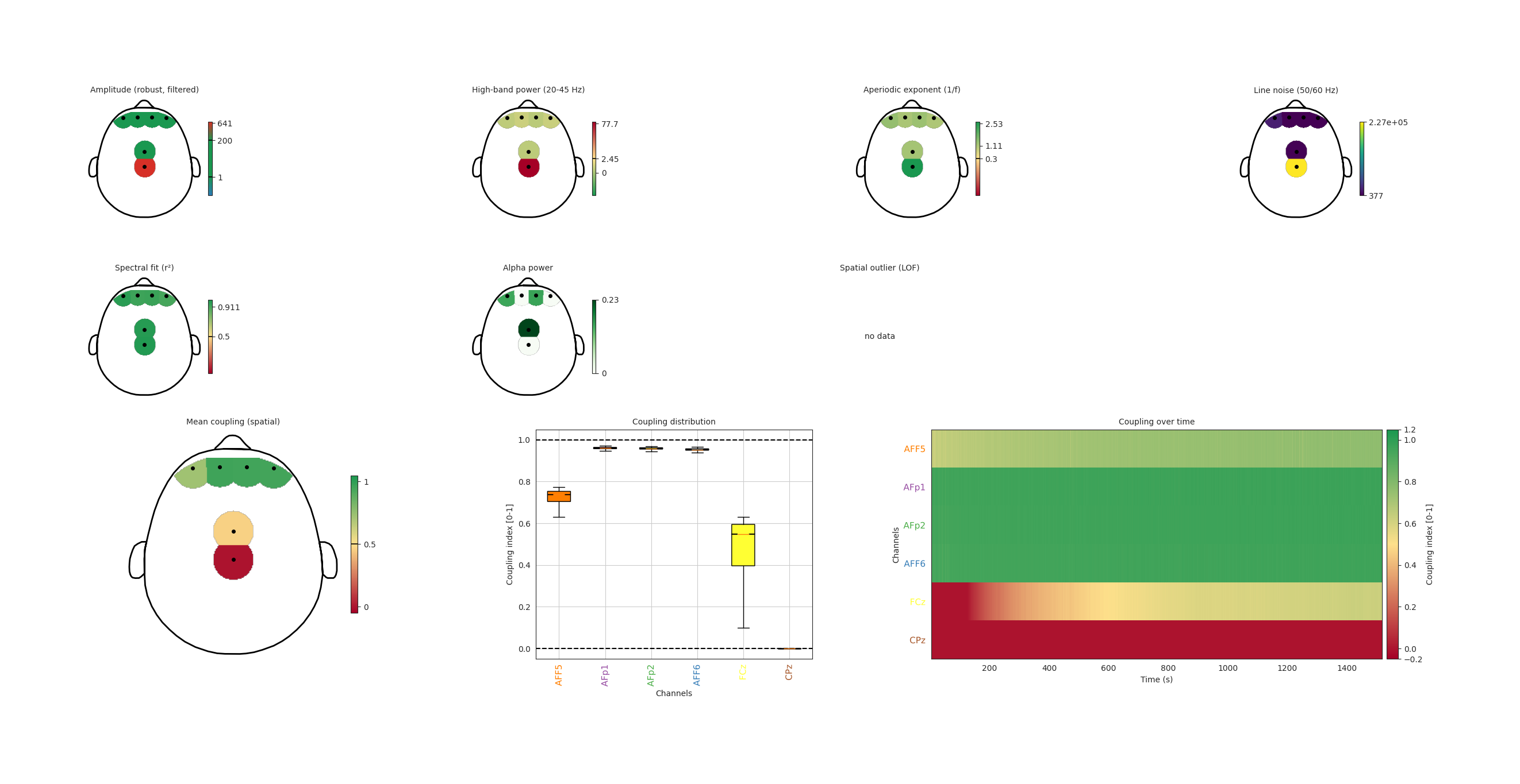 This section shows the per-electrode metrics behind the summary as scalp maps. There is one topomap per criterion — amplitude, high-band (20–45 Hz) power, aperiodic (1/f) exponent, line noise, spectral fit, alpha power, and (on montages with 20 or more electrodes) the spatial-outlier (LOF) score — each colored green inside the acceptable range and red outside it, with the cutoff marked on the color bar (for amplitude and high-band power the cutoff is the session-relative outlier boundary, so it adapts to each recording; alpha power is informational). Below the metric maps, the (proprietary) coupling index — a value between 0 and 1 measuring how well each electrode is coupled to the scalp (1 is best) — is shown three ways: as a scalp map, as a per-electrode distribution, and as a channel-by-time heatmap (aligned with the task structure, if any).
Interpretation
These maps show where and why a channel was flagged. Amplitude that is very low indicates a dead or poorly-coupled electrode, and very high indicates a noisy one; a healthy spectrum has a clear 1/f slope and a good fit; elevated line noise or high-band power points to environmental, muscle, or bad-electrode contamination. Higher coupling (>= 0.6) is desirable, and the coupling-over-time heatmap reveals whether contact was stable throughout the recording or degraded (for example, after movement).
Spectra
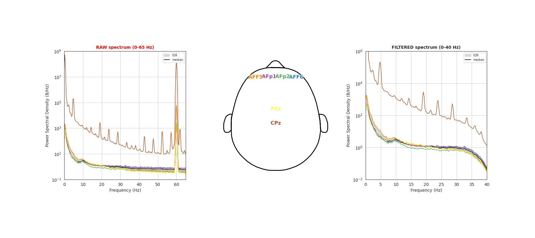
This section shows the power spectral density (PSD) of the RAW (unfiltered, 0–65 Hz) and FILTERED (0.1–40 Hz band-pass, 0–40 Hz shown) EEG side by side, with a channel-color key (a head showing each electrode's name in its trace color) between them. Each panel plots every channel faintly, together with the median ± inter-quartile-range envelope, and emphasizes the most deviant channels.
Interpretation
The EEG power spectrum typically follows a 1/f distribution, reflecting the aperiodic component of the signal. A peak around 10 Hz corresponds to the alpha rhythm, which is especially prominent in occipital electrodes. A distinct peak at the line-noise frequency (60 Hz in the US, 50 Hz in Europe) is common and tends to be more pronounced in channels with poor electrode contact. Channels that sit well outside the envelope are outliers worth inspecting. The FILTERED spectrum reflects the data after the band-pass filter (0.1 Hz high-pass, 40 Hz low-pass) applied by the analysis pipeline, which suppresses slow drift and line noise so the physiological band is easier to read.
Filtered EEG traces
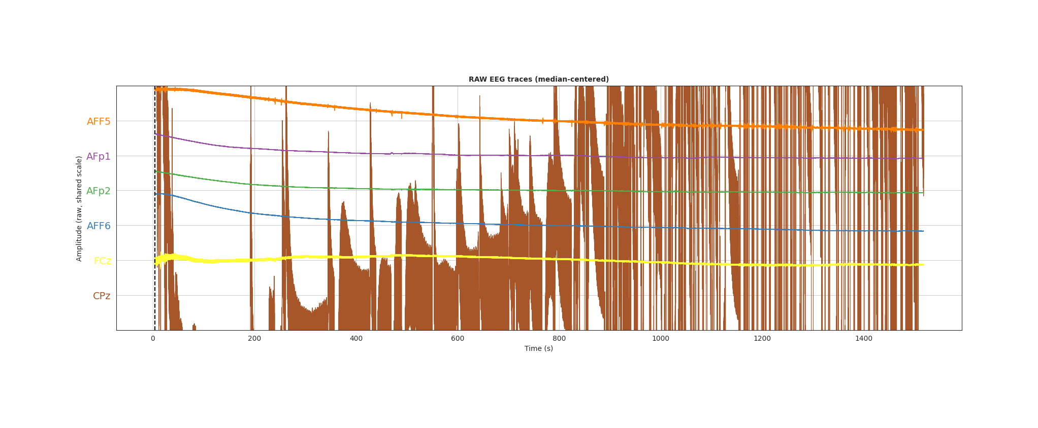
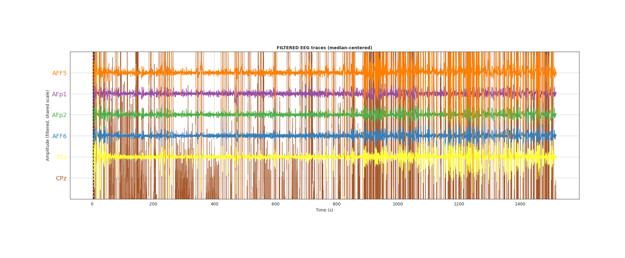
This section shows the filtered (0.1–40 Hz) voltage time course of every electrode, stacked and baselined at the start of the epoch on a shared amplitude scale, colored to match the spectra color key and overlaid with the task structure if applicable.
Interpretation
This view makes amplitude differences directly comparable across electrodes: a flat trace indicates a dead channel, and an outsized trace indicates a noisy one. It is also useful for spotting missing data or transient artifacts over the course of the recording.
Sync Accessory Box quality control report
The Sync Accessory Box QC is only relevant if you purchased a Sync Accessory Box and it was properly plugged into the data acquisition computer during the recording of this dataset.
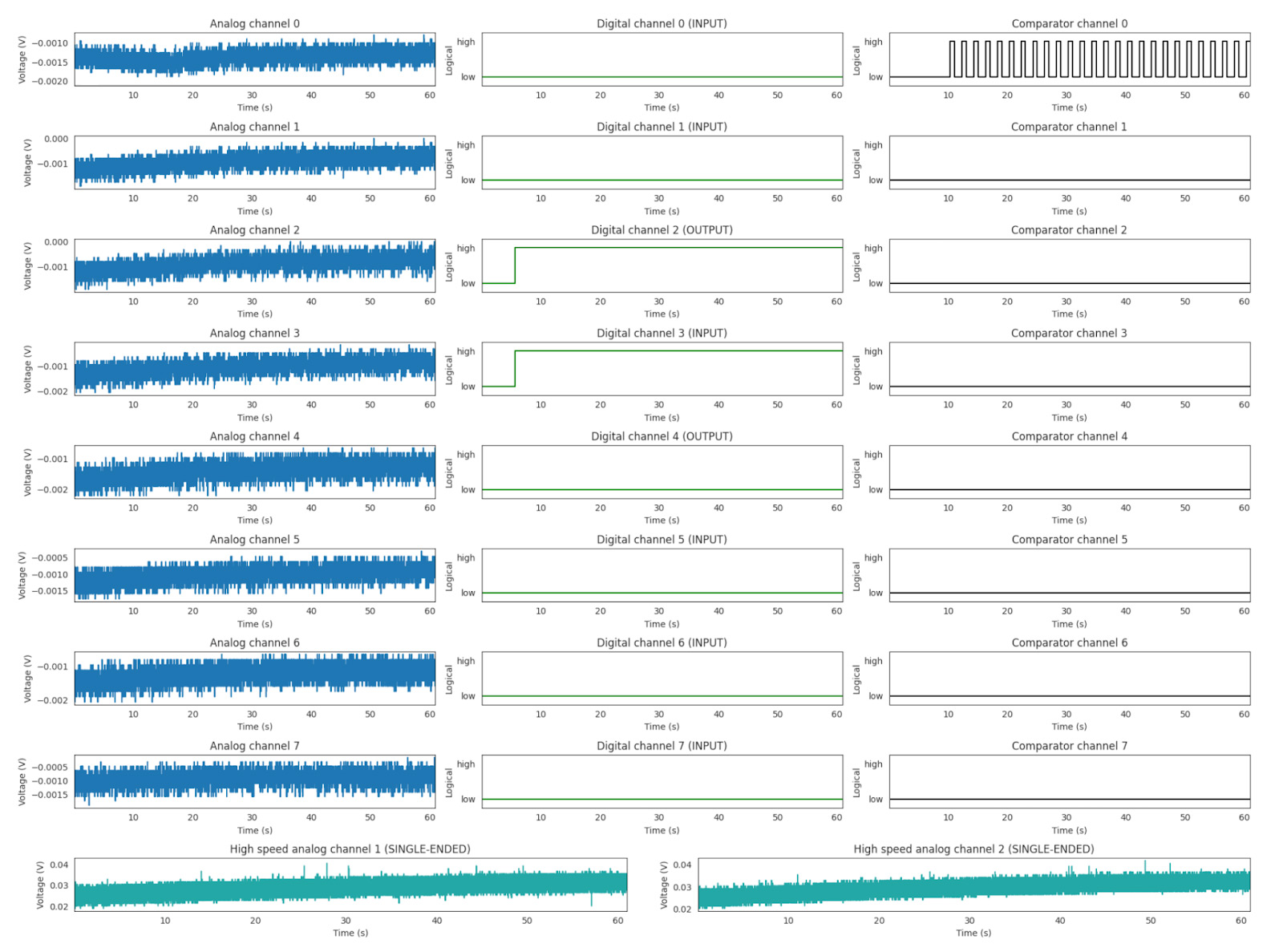
This single multipanel figure displays the outputs from each of the Sync Accessory Box streams as a time series over the course of the experiment. In the analog channels, the data are visualized with a continuous y-axis (voltage). In the digital and comparator channels, a logical “high/low” is used to visualize the data.